Decoding the Unilever Logo Design – the Logo With Many Many Elements
It takes ages for big companies to reach their milestones. Quality products, services, flawless consumer service and ability to create a competitive edge is some fo them. However, having a strong impression among the people is also a crucial factor that contributes towards a brand image immensely. Today, we will discuss one such great logo design.
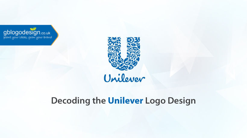
Unilever is a consumer goods manufacturing brand that is based in numerous nations throughout the globe. The current logo has been in practice since 2004 and was designed by Wolf Olins, the brand consultancy of Unilever. The Unilever logo design comprises of 24 icons, accumulated in the shape U. Let’s decode them, one by one.
1. Hand – it represents care and hygiene and relates to the products like soap, and also perfumes/deodorants.
2. Ice cream – it represents the many ice cream and frozen desserts it offers.
3. Hair – it represents the hair care and beauty products.
4. Swirl – it represents the perfect blends of flavors and taste, that it offers in its products.
5. Fish – it represents fresh food, that it collects from the sea and other natural resources.
6. Lips – it represents communication and openness.
7. Particles – it represents the research and development, a crucial aspect of product diversification
8. Clothes – it represents apparel, that evokes confidence and comfort.
9. Bee – it represents hard work, evoking communal harmony and reducing adverse environmental impact.
10. DNA – it represents their unique identity and heritage and also denotes the positive change it brings.
11. Packaging – it represents offering the best consumer experience.
12. Palm tree – it represents the brands’ respect for nature and motto to coexist with a healthy environment.
13. Transformation – it represents the willingness to undergo the best transformation.
14. Waves – it represents freshness and cleanliness.
15. Sun – it represents renewable energy and aims to reduce greenhouse gases.
16. Heart – it represents love and care, and determination to offer people healthy products.
17. Dove – it represents empowerment and freedom.
18. Plant – it represents focusing more on the preserving environment
19. Bowl – it represents food that is both healthy and tasty.
20. Virtuous cycles – it represents recycling and reducing waste materials.
21. Spoon – it represents nutrition and other cooking products.
22. Spark – it represents the catalysts that connect the brand with suppliers and distributors
23. Chili pepper – it represents collecting ingredients from fresh agricultural products.
24. Flower – it represents the sensitivity towards nature and the consumers.
The logo design is just too perfect to make any alteration, isn’t it! that’s what we call a perfect example of customized logo design.


