6 Logo Design Trends To Try in 2017
2017 is about to end in couple of months, but not before providing an ample amount of opportunities for growth and development. The competition to grab all these benefits is significantly high, and it is crucial to keep up with the current trends to gain competitive advantage. Rebranding can just be the thing to stand out in the competitive market, and what could be more suitable than getting a logo upgradation!
Market survey states that redesigning your logo to meet existing trends and simplifying brand recognition has helped over 67% of companies in UK. Even the big names in every industry opt for logo upgradation at regular intervals. Dont believe us? Take Google, HP and Instagram for example!
A professional logo is the perfect way of effective branding and thus, we bring you a list of newest trends in the domain of professional logo designing in 2017.
1. Broken Letter
A simple logo can be made fancy by breaking letters into two or more segments. For instance, the mathematical symbol infinity is broken down into two more decorative symbols for the logo of the brand ‘Infinity’.
2. Repeatation and Replication Pattern
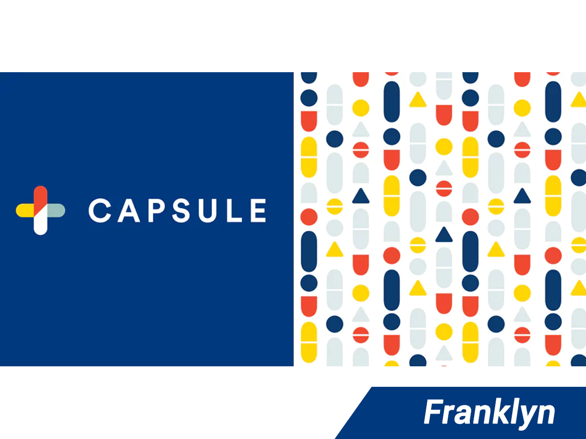
Why always go for new symbols when cool ones are readily available! The logo of ‘Capsule’ comprises of two multicolored capsules arranged perpendicularly to one another. To design the other half, the elements of these capsules are broken down and arranged in patterns.
3. Geometrical
When nothing else works, go for geometrical logos. Not only these are easy to create, but also helps to keep a long lasting impression in the mind of people. And as an additional benefit, it is likely to be preferred over the fancy ones, particularly by people with OCD. The log of ‘Verify’ is created with breaking triangles and lines.
4. Crop and Zoom In
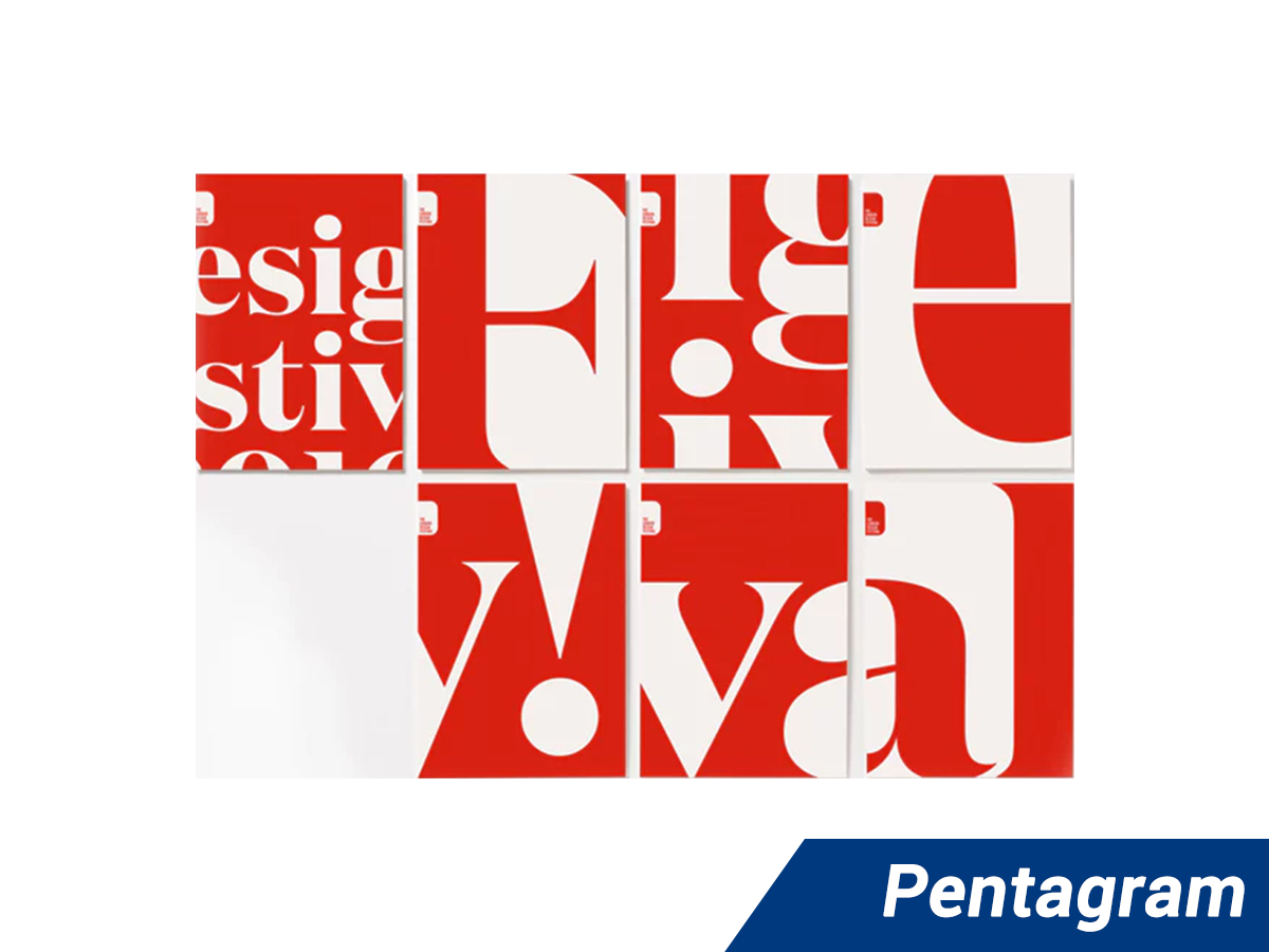
Who says, you must go for some fancy patterns to start a trend. The crop and zoom in logos are one of the most happening trends in the graphic world. The logo of ‘London Design Festival’ is a simple text logo of red and white, cropped to look classy.
5. Photographic background
A logo can be made extraordinary by adding a photographic background to it. The logo of ‘Early Bird deals’ has an attractive photo background complementing the name of the business and its tagline.
6. Try Simplification
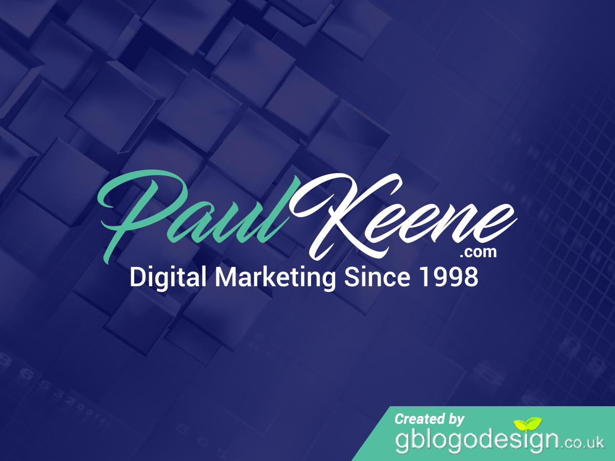
When addition, multiplication, and division lead only to a complication, try simplification! The logo of Paul keene comprises of simple text, stating the nature of the business.
From being simple to unique, each of these professional logo trends have a unique charisma. So, keep in mind to catch up with the trend. However, feel free to be open to other new trends as well, you might end up setting a new trend in 2018!


