Tag: Logo Design UK

Logo Design [blog]

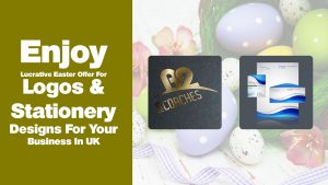
Enjoy Lucrative Easter Offer For Logos and Stationery Designs For Your Business In UK

Easter is a rather special time of the year. It falls on the first Sunday, following Good Friday after the Paschal full moon, that onsets on or after the Spring Equinox. The exact date of Easter is on roll every year, even when the dates for Christmas and Halloween stays predictable. The date of Easter can range anywhere between March and April 25. The easter being a significant event of religious belief is celebrated among people with a great enthusiasm.


People often spend about 200 Pounds each, during this festive time, solely on the Easter Franchise.


In this cutthroat market, having a competitive edge is crucial to have impression among the target audience. Thereby, having a creative marketing during this time can significantly help the business to earn high revenue, by increasing its visibility and eventually its sales.


Getting an Easter-themed logo is an extremely effective way of attracting the attention of the target audience. Having an easter themed logo is beneficial for both startups and established businesses. For the prior type, it compensates for the shorted budget allocation for easter campaign and for the later it creates a competitive edge over the counterfeit brands.


We, from the house of GB Logo design, present an Easter-themed logo of Cadbury. During easter chocolate itself gets sold in the figures of millions. As Cadbury has its place in the realm of chocolate, it is only justified to revamp its logo.


The Easter-themed logo of Cadbury has its originality intact. However, a pair of bunny ears and teeth along with a few easter eggs is highlighting its tribute to this Easter season. Moreover, a bunny cannot stay hanged onto the thin air, so the bushes around complete the look. In a nutshell, it is a perfect logo for the season. You can get your logo dressed in Easter spirit as well.


To inspire you for the same, we at GB Logo Design present lucrative offers exclusively for easter. You can not only get your logo revamped, but also get fresh logo designing packages for your business along with other corporate identities. We are offering flat 50 percent discount on Logo design packages and other lucrative offers of other corporate identity designs such as stationery, business card, flyer, brochure etc.


Easter marks the resurrection of the Jesus after his crucifixion. So, make this season of Easter your gateway to resurrect your business in UK from the darkness of generic logo and incompetent corporate identities and mold it to achieve greatness.

Logo Design [blog]

6 Splendid Mascot Logo Designs That Make Every Business in UK Want One

You must have heard that getting a customized mascot for your business, adds a unique identity to your brand. But what is a mascot actually? Upon hearing the word McDonald’s, it is impossible to miss the icon of Colonel Sanders, isn’t it? That is the mascot of McDonald’s.


The mascots are any special characters attached only to one specific business. Just like a fingerprint, it defines one business solely. It cannot be used by any other business, without facing severe legal hindrance. Several businesses in UK these days are getting customized logo design with the mascot in order to increase engagements and to mark their unique impression in the market.
 

Here we present 6 superb mascot logos designed by GB Logo Design-

1. Cheeky monkeys


The mascot for the logo of Cheeky Monkey is undoubtedly a Monkey. And to justify the name of the business, the monkey is posing in a very cheeky gesture as well. Being a business being amusing and appealing is clearly getting delivered through this well-designed logo.


2. Bunny in hole


Some like cats, some like cobras, but everyone likes bunnies for sure. Bunny in Hole is a business for everyone. The message is spread by the cute little bunny, the mascot of the business, quite effectively. Moreover, the peeking of the bunny out of the hole keeps an element of surprise intact.


3. Griffin Motorsports


Who said only living creatures are fit for being mascots? The legendary mythical creatures work as well. The Griffin motorsports uses the Griffin as its mascot. The business represents its commitment to deliver powerful and majestic motorsports and also assures of heavenly experience to its customers.


4. Busy Bee


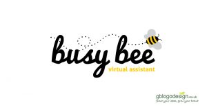
Everyone is a busy bee these days. However, the business of Busy Bee thrives to be the best virtual assistant for your personal and professional need. However, the assistance must not interfere unless being summoned. To keep this idea intact, the mascot for the logo of Busy Bee has been allocated to a small honey bee. Fly in when called for.


5. Boa Vista


Boa Vista is a business inspired by the concept of a bistro that offers a range of coffees. The logo of the business uses its mascot as a Boa Turtle, along with coffee beans. In a nutshell, it is a logo, which has been designed to keep its individual essence intact and impactful.


6. Courses Ninja


The first image of a ninja everyone has, is a human figure, who is rough, tough, kicking and punching everything around, right? But the ninja that serves as a mascot for this business, dressed in all black, holding a Nunchaku in one hand and showing a punch with the other, is rather attractive and cute.


Want to have a customized mascot logo design for your own business in UK? Join hands with GB Logo Design and get the mascot that defines the business for you.

Logo Design [blog]

4 Amazing Logo Design Options For Security Service Provider in UK

A logo is undoubtedly the most impressionist icon of any brand these days. However, the process of making the ideal logo for a brand has become a lot more challenging these days as the pressure of competitors is increasing at a very fast pace simultaneously. Thereby, it makes every quality brand in UK to own a customized logo.


We, at GB logo design, deliver customized logo only after evaluating its need and creating them with huge precision. To help them evaluate and utilize it better, we offer multiple options for a package.


Hereby, we present 4 of our logo design options for Aztec Security Solution, business in UK. As the name clearly indicates, the business deals with providing security solutions, it only fits right that we used the red color for the same. The color red attracts attention more than any other color. Moreover, it encourages the consumer to take action in the realm of business.
 

The first logo option is a simple logo with a ‘mind-boggling’ maze-like structure inscribed within a triangular outline. The logo delivers the message of providing top-notch security by crafting a flawless security system. It ensures any potential perpetrator will face grave challenges upon an attempt to deprive the safety and privacy of the users.

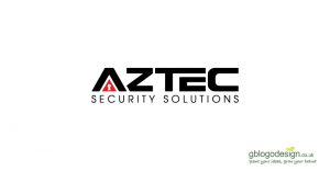
The second logo option inscribes a lock underneath the letter ‘A’. The logo clearly can infiltrates the mind of the customers, regarding the nature of the business. It is an exceptionally well-crafted design that will help the brand establish its unique identity among the race of competitors.
The third logo option has a triangular element painted in black. It inscribes an arrow-like structure shooting upwards with 2 corresponding lines in between. It demonstrates how the business creates levels of security to ensure their client’s privacy and safety stays uncompromised, even upon any event of an intrusion.
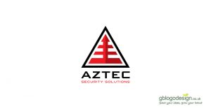
The fourth logo option is a rather interesting one, which has been designed to resemble a pyramid. This particular logo is timeless as it uses an iconic representation of secrecy and security, the pyramid itself.

As per our client’s demand, we have designed logo lockup using a meaningful icon and the name of the business. This logotype ensure that the nature of the business is conveyed most effectively along with the name of the business. Moreover, the usage of the triangular element for the logo design is persistent as it represents strength, stability, efficiency, and organization.


Inspired by our work and want to make your own brand as well? Explore our packages and portfolio and get started.


Logo Design [blog]

6 latest Logo design trends of 2018 that every business in UK needs


Only 2 months have passed in the new calendar year and many of the logo trends of 2017 are on the verge of being outdated. The businesses in the UK are already looking for more trendy logo designs in the year 2018.


In this regard, here we present some of the logos designed by us, as per the latest logo design trends of 2018.


1. Space Utilization


Gone is the time, when the logo of a business had enough space to build a bridge in between. The new trend is to utilize the entire space in a crafty way. The logo of the business A2 mini coaches utilizes the space between A and 2 wisely.


2. Geometry


Geometry is no new thing, but instead of putting any random shape for any business, now it’s time to add context to it. The logo of London Pay uses geometry to produce visual enhancement, confirming the commitment the business of delivering persistent monitory benefits. It delivers a clean, elegant and easily perceivable visual of the brand.


3. Monocolored logo


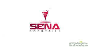
Having a multicolored logo is an old-fashioned thing in today’s simple, yet the elegant world. So, going for a single color is a new thing in the logo designing realm. The logo for the business Sena Cocktails has been designed solely with red having the exact same thought. The red color delivers the urgency to take actions. It is undoubtedly the perfect color for this business. Moreover, the glass with bubbles and straws on it complements the logo well.


4. Simple, Iconic logo


The competition in the market is so huge these days, often a business needs to make its logo self-explanatory to deliver the message clearly. the logo for Trip the Brain has its main element as the brain with several small nodes depicting the nature of the business clearly, for its target audience.


5. Handwritten text


Writing in a formal ‘Times New Roman’ might have looked elegant in the past, but that is all old school now. Instead of having a diversified typography is the new trend. The logo of Trustmgt Stewardship has been designed with stylish, yet legible typography.


6. Creative typography


The logos of businesses are being designed with more creative style than before. Using its product or services as its main element is a new thing. The logo of Brick workshop has been created by assembling miniature icons of colorful bricks.


Want to make the logo of your business in the UK with the latest logo trends as well? Get on-board with us and shine among the competitors in the market.


Logo Design [blog]

8 Circular logo designs that shaped the businesses in UK

Geometry plays an important role in every aspect of life. Though the usage of triangular logos has its importance, the influence of circle is more prominent than any other geometric shape, when it comes to logo design.


It has been used by many global businesses such as At&T, WordPress, Audi, BMW, Olympics and many more. Its popularity is inspiring many businesses in UK to go for customized circular logo design for themselves as well.


Let’s understand the significance of circular geometry along with 8 splendid examples of circular logos.


A simple circle represents uniformity, control, unity, sense of wholeness, and perfection. Interlocked circles often represent independence, union, and strength, whereas concentrating, echoing circles represents stability and visual comfort. In a nutshell, it communicates visually about the business to its target audience most efficiently.


Now let’s have a look at 8 of the splendid examples of circular logos designed by us.


1. 2 Moons Computing

The logo uses 2 overlapping circles in colors blue and green to indicate the amalgamation of its 2 entities, representing a stronger commitment towards its clients.


2. MCI Capitals

The logo uses several layers of concentric, broken circles, with circular icons in each. As the business deals with monetary aspects, the logo represents that the money one invests stays safeguard through many layers while doing business with MCI Capitals.


3. We the people

The logo for We the people has been well designed by making it resemble the globe itself. It emphasizes harmony and unity of the people.


4. Bella Cabello

The business deals with providing hair extension and similar products. The logo uses white silhouette enclosed in a decorative circular border. Overall, it conveys a classy and fancy emotion to its customers.


5. Bounce Back Canine Massage

The logo of this dog massage business has been designed with interlocking 2 of the letter ‘b’, which is the initials of the business itself. One of the initials consists a silhouette of a hand and the other one consists that of a dog. It represents the eternal bond between man and dog and how much their comfort and health means.


6. Dolce Latte

Dolce Latte offers a range of ice creams, pastries and coffee. The logo for this business has been designed in the circular shape enclosing the initials of the business, representing the latte art.


7. Dutyfirst Solution

The logo of Dutyfirst is designed by joining 3 human icons at their hands. Altogether it represents a circular design. It emphasizes the commitment the personals of Dutyfirst solution provides for their clients.


8. Dickinson Aesthetics

The logo of Dickinson aesthetics is designed by interlocking 3 different circular rings. It represents their ability to deliver unique products and services to each client as per their individual need while maintaining uniformity in their best quality.


These are some of the examples of circular logos that have been designed by us. Are you excited to get your customized circular logo design as well? Get on board with us and uplift your brand like never before.

Logo Design [blog]

7 Brilliant examples of wordmark logo for Businesses in UK

What is the common thing among corporate giants such as Google, Facebook, Disney, Microsoft, Wallmart, Dell etc, other than their high esteem? Well, it is their self-explanatory logos! This type of logo, showcasing the name of the brand is known as the wordmark logo. Each of these examples motivate businesses in UK to adapt wordmark logos as well. It is the most prevelant logo type among the 4 Common types of Logo Design for UK Businesses


Wordmark logo has high scope in the domain of logo designing. It is most effective for brand recognition as it conveys the nature of business through the logo itself. It is often adopted by the businesses with the limited budget on marketing.


So, let’s begin the countdown of 7 amazing wordmark logos made from the house of GB logo designs.


1. Woodhouse

The business deals with providing architect buildings for gardens. Having a fancy name might not have conveyed the purpose so effortlessly. The wordmark logo of Woodhouse consists of the name itself along with an outline of a small flower surely does the same.


2. Travel Bazaar

A spontaneous trip might sound fun and excite for youth, but for families and corporate trip, the more you are prepared, the better. Travel Bazaar, thrives on offers solution for every need of the traveler. The alphabet ‘B’ has been comprised of miniature travel icons, highlighting the domains, it represents.


3. Floortble

The name of the business floortble, itself is quite interesting, and it surely conveys its message when transformed into a logo. The wordmark logo is further designed with split typography, in which the letters ‘tble’ into a tile in order to complete the look of the logo.


4. Not Fur Long

There are several businesses in pet care, but this business deals with dog grooming. The wordmark logo comprises of a small silhouette of a puppy to make it even more transparent.


5. Rosie Glow Candles

Obviously, candles are available in supermarkets in a wide range of price and sizes, but the Rosie glow candles offer special ones, which includes handmade, organic, scented candles. The wordmark logo of Rosie glows candles also has 2 small icons of flower and bird to represent a unique fragrance and freshness it offers.


6. Sandras Nursery Corner

Sandra’s nursery corner, as the name clearly depicts, is a baby daycare business. The color pink depicts affection, harmony, friendship, inner peace, and approachability. In a nutshell, it encourages bonding among children. The wordmark logo of Sandra’s nursery corner also has 3 little stars, depicting every child is as special as a star.


7. Office Furniture 4 U

Office furniture 4U is a business whose name itself is self-explanatory. The wordmark logo uses formal topography to convey its formal nature of the business.


Inspired to get a wordmark logo design for your business in UK as well? Get onboard with us and check out our logo packages.

Logo Design [blog]

4 Common types of Logo Design for UK Businesses


Logos play a crucial role in branding and advertisement. Needless to say, each business in the UK, regardless of its nature, must have its own customized logo design. Depending on individual need and preferences, one might pick any kind of logo. However, today we will discuss 4 major kinds of logo designs.


So, let’s begin the countdown!


Wordmark logo

As the name itself implies, the wordmark logo is simply the name of the business graphically recreated to look more attractive. It is done by modifying the topography, font, colors, spacing and geometry etc.


Having a wordmark logo ensures that the entire name of the organization is showcased to the target audience. Undoubtedly, this ensures perfect brand recognition without any scope of confusing it with a competitor. This is particularly beneficial for small business and startups who are yet to make their impression on the market.


Lettermark Logo

A lettermark logo serves as its monogram, as it is designed using only the initials of the brand. The lettermark logo has wider scopes in academic and financial institutions as they often use their acronym instead of the entire name.


It is also convenient for the businesses, having an exceptionally lengthy name consisting 4 or more words.


Brandmark logo

The brand name logo is represented by a symbol of the business, without the name. It is mostly used by the global businesses, whose symbol itself is enough for recognition. However, it can be utilized by small businesses as well. It is also useful for businesses having a difficult pronunciation or a lengthy name limits the scope of wordmark logo.


Logo lockup

The logo lockup is a combination of two or more singular logo elements. Their clustering itself gives rise to the term lockup. It is often done by placing a meaningful icon/symbol along with a slogan to boost the purpose of the business.


It is particularly helpful for businesses with a wide product diversification. In that case, the main element of the logo can be clubbed with an individual domain to create a particular logo for better targeting.


So, which logo is best for your business in the UK? Well, that is a tricky question that needs some decent amount of time, research, and skills to evaluate for sure. It depends on the scope of the logo for your business as well.

Logo Design [blog]

The Journey of Logo Design Through The Ages

The logo design is the first thing one notices about a business in UK these days. There are several types of logo designs that include wordmark, lettermark, brandmark and logo lockup types. Moreover, to make logos even more unique, new trends emerge every now and then. These facts give rise to a common misconception that logos are an integral part of the modern business solely, but in reality, logos has been a medium of establishing a unique identity from the ancient civilization itself.


Let’s have a look at the evolution of logo through the ages.


A logo in simplest term is a visual identity of any individual, group, or organization. In the ancient times, the earliest forms of logo exist in the form of the heraldic crest, religious symbolics, and signage.


Heraldic logos were royal crests delivering the element of societal influence and status. A particular set of icons represents a certain monarch. It was later further modified to create an individual coat of arms. The religious seals were used to represent recognition, power, and authority among the people in the society. These logos were carved in cylindrical seals.


When the era of commercialization of various goods and services began, logos were created to deliver the nature of the business. They were mostly done on clothes and jute materials and used to be tied or nailed to the property of the business itself. Gradually, when more and more businesses came to emerge providing the same or similar services, these images and business names served as the logo to create the distinction between themselves and gave birth to the concept of brand loyalty.


The birth of industrial revolution brought a huge competition in the market and then came the need for advertisement and marketing. During this time, the logo was created on paper and also printed in a mass production to enhance the scope of a particular business among the others. Moreover, exploring the various elements of the typography and getting ownership of the logo became an integral part of the logo industry during this time.


Then came the current, modern era, where the importance of having a logo is so crucial that every stagnant business, organization, and community must have a personalized logo design. These days, many software is used to create unique logos, instead of sketching on paper. However, it can also be seen in a range of stationaries, and other business identities as well, as a way of promoting the business.


Are you struggling with the thought whether or not having a customized logo for your business in UK is crucial? Throw away your second thoughts and get one customized logo for your business.


Logo Design [blog]

Client’s Guide to Logo Ownership

In case, you are operating a business in UK, you must have considered getting your custom logo designed to compliment your brand. The logo holds a great deal about your company and thus its ownership enables you to have certain perks. The history of lawsuits for copyright infringement is pretty long, it has been filled and battled over and over in the entire course of time.


Ideally, the ownership should belong to you as the client and should be transferred along with the logo while paying for the service. However, several designers/designing firms either misguide their clients to refuse to cooperate. Today, we present the reason why you must get your custom logo design done, exclusively from the company that provides you its ownership as well.


1. Liberty to use

Your business needs to showcase your brand logo in several corporate identities. These include business card, letterhead, stationaries and in broader pictures, can also be featured in billboards and corporate jets. Having the ownership enables you to use it at any point in time, and on any material, without any concern or dilemma.


2. Rule out the scope of future conflicts

It is important that the full ownership of the logo gets defined and certain between the client and the designer/designing firm from the beginning itself. If not, it might lead to confrontation and reuse of your brand logo in future. This will create confusion among your target audience and eventually dilute your brand reputation.


3. Ease of getting copyright

Having full ownership, enables you to get an authorized trademark from a regional or national registry. It ensures you to win your claim against any competitor wrongfully infringing your logo.


In case you are wondering, why a designer would not transfer the full ownership to you even after getting paid for creating a unique logo for your business, we present you few most prevalent reasons for it.


Possessiveness of the designer about the creation is a very common reason for the same. Since, they spend hours and hours, brainstorming, creating and revising it, they can’t seem to let go of it, entirely.


The intention of reusing it yet another reason for it. some designer might like the concept they created for one particular business and see a wider scope of its usage (with little revision) for many diversified brands as well.


Few amateur designers, however, intentionally keep the aspect of ownership in dark. They mostly do it in order to keep a window of legal opportunity, open. They might even ask for royalty or commission everytime the logo is used. It is considered as unethical and unprofessional.


Hereby, it is crystal clear how important it is to have the full logo ownership, since the point of purchase itself. Thus, avail custom logo design for your business along with its copyright, to rule out any possibility of design theft in the future.

Logo Design [blog]

Top 15 UK Business Logo by GB Logo Design in 2017

Another year has passed and this period of 365 days had given an ample opportunity for every business in the UK to grow in terms of a new horizon, product mix and more. As the logo represents a crucial role in the overall branding of the business, it is obvious that the ones with a perfect logo design have extracted more opportunities than the others.


Let it be comprised of the elements of shadow, broken letters, fades, rising colors, wrapped and overlay text and icon. It is important that every business in the UK gets a custom logo.


Here we present 15 of our best logo designs that we had made for a variety of businesses in the year 2017.


1. Bow-Ho

Logo Design UK

The element of the bow, constructed by 2 overheating arrows make the logo perfectly intact and memorable.

2. Apple MedTax

Logo Design UK

The icon of Apple makes the logo stand-alone form the rest of its competitor’s logo and makes a long-lasting impression.

3. A problem shared Psychological Services

Logo Design UK

The business deals with helping people with Psychological disorders. And since the first step of seeking treatment begins with sharing problem, exchanging views and thoughts are extremely crucial. In a nutshell, the logo serves its purpose by conveying the agenda of the business.

4. Zenergy

Logo Design UK

The logo depicts the icon of a person meditating. The color blue is used extensively as it represents intelligence, faith, truth, loyalty, wisdom, trust, and confidence. Overall, it is beneficial for both mind and body, conveying the nature of the business.

5. Elmhouse Childcare Nursery

Logo Design UK

The logo has been well crafted for the child day care business. The blue silhouette of the home encircling the growing tree represents the care provided by the personals while nurturing the toddlers.

6. Lucky Star

Logo Design UK

There are lots of real estate agencies and investors in the market. But not all of them can help you strike a deal, good enough for you to be lucky. This stand-alone business certainly needed this perfectly designed logo to convey the message.

7. JEM Fruits

Logo Design UK

This fruit exporter needed a simple and subtle logo to make its target audience aware of the nature of its business. This logo is surely easy to remember and hard to miss.

8. Taylor Made Physiques

Logo Design UK

The business deals with providing physical fitness as per the custom need of every individual. The logo depicts the nature of the business perfectly well.

9. Residential Group

Logo Design UK

The logo represents an outline of a rooftop along with a silhouette of a man in green, a color to represent growth and prosperity. A cleverly designed logo to match the business offering residential services to the common people.

10. IBDA solutions

Logo Design UK

Not every logo needs a Hercules, lifting the globe in order to imprint an impression. The logo of IBDA solution is a simple textual logo in fading colors, yet it is perfect for engaging its target audience.

11. Hobbs Cleaning Services

Logo Design UK

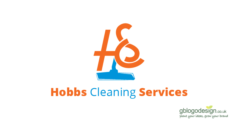
The logo for this cleaning business was highly appreciated as it comprised of every single element of the services that it offered. The initials of the brand clubbed with the icon of a mop is hard to compete with.

12. Select Sports

Logo Design UK

The logo of Select Sports has icons of a range of balls associated with various sports, matching the spirit of the business that lets you test your skills in a wide range of sports.

13. Picnic Club

Logo Design UK

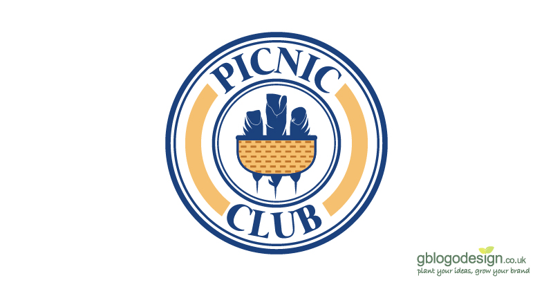
A weekend picnic is a heavenly gateway from the never-ending, tiring weekdays. So, we designed the logo with icons of a basket and features, adding a hint of relaxation and recreation with friends and family.

14. HML Law Ltd.

Logo Design UK

The HML law firm stands for the cause of its every client and thus their logo comprises of the global icon, deciphering that the business stands to provide legal solutions of every domain.

15. AJE

Logo Design UK

This logo was well researched and designed for this event styling, entertainment, and production business. The golden color adds the hint of sophistication and richness, that the business delivers to its clients.


In a nutshell, the year 2017 was filled with several opportunities and challenges for our designing firm, we had successfully delivered some of the best-designed logos for our clients in the market. Want to get a catchy logo for your business in the UK as well? Get on-board with us and uplift your business recognition like never before.