Tag: Logo Design UK

Logo Design [blog]

6 Royalty Inspired Logo Designs To Impress You!
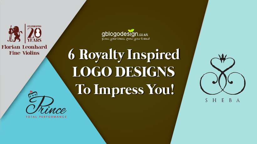
 

Since ages, crowns have been a privilege only to the monarchs. But today, one does not have to be ‘his or her highness’ to use it for their personal and professional usage. One can easily get customized logo designs comprising the elements of royalty. These are fun to make, great to showcase an excellent to attract the target audience.


Check out the 6 royalty-inspired customized logos we made in-house of GB Logo Designs.


Read more- 6 splendid logo design from GB Logo Design


1. Prince Total Performance
 

It is an extremely simple wordmark type logo design. But the addition of the crown over the letter ‘P’ makes it a unique that is bound to grab more attention than its competitors. A princely logo for a princely business.


2. Sheba


The logo of Sheba is a text mark type logo design, that uses the business initial S, superimposing it as its original and its mirror orientation. The point of its junction is groomed with a small, royal crown. In terms of literature, it is a perfect tribute to the biblical ‘Queen of Sheba’.


3. The Great British Raj
 

This restaurant logo design that specializes in the Indian cuisine. The logo uses the white silhouette of Taj Mahal and Union Jack as the background with a waiter in traditional uniform, serving a platter of fine dining. Eating out in this restaurant certainly will give the feeling of royalty.


4. Florian Leonhard Fine Violins
 

We had the privilege of designing the customized logo design for its 20th anniversary. The logo comprises of a majestic lion, playing the violin, along with a patch showcasing the 20 years of celebration. The logo certainly adds an element of the royalty to this business.


5. Hallwilder Emporium


This emporium is not just like any other emporium house. Its professionalism and expertise in doing what they do make it a stand-alone among the swamp of a competitor. It looks more like a coat of arm, but then again, it is not your average emporium house.


6. Heir’s places


This logo design literally is a time travel switch that makes us have a quick visit to the Victorian era. The logo is designed as a door knocker is designed and decorated with a majestic lion. Its very sight gives an impression of the passage to a castle. A logo design hard to miss among every average design.


Does your business have an element or two of royalty? Then why settle for a regular logo when you can proudly flaunt your business among your people. Hire GB Logo Design to make it happen, in its glory!


Logo Design [blog]

7 Clever Restaurant Logo Designs That Instantly Make You Want A Bite Out!
 

“An empty stomach is not a good political advisor.”

As Albert Einstein has rightly said, an empty stomach is a not a good start for any good day. In fact, around 5 out of 10 orders we receive for logo design package, is somewhat related to the food industry itself. As you might have noticed, red and yellow are the prominent colors for the food industry. It evokes appetite in people.


Here we present 7 logo designs that were made by the house of GB Logo Designs for the restaurants.


Read more- Fitness center logo design by the house of GB Logo Design.


1. Hunger Shack


This food business totally supports people who love to eat. Their logo literally is the pictorial representation of the business name. The color red, evokes the hunger and the cut out of a bite, moreover, heightens the emotion among the food lovers. It literally says, ‘if anyone lectures about your eating, eat them too’.


2. Kobe Sushi


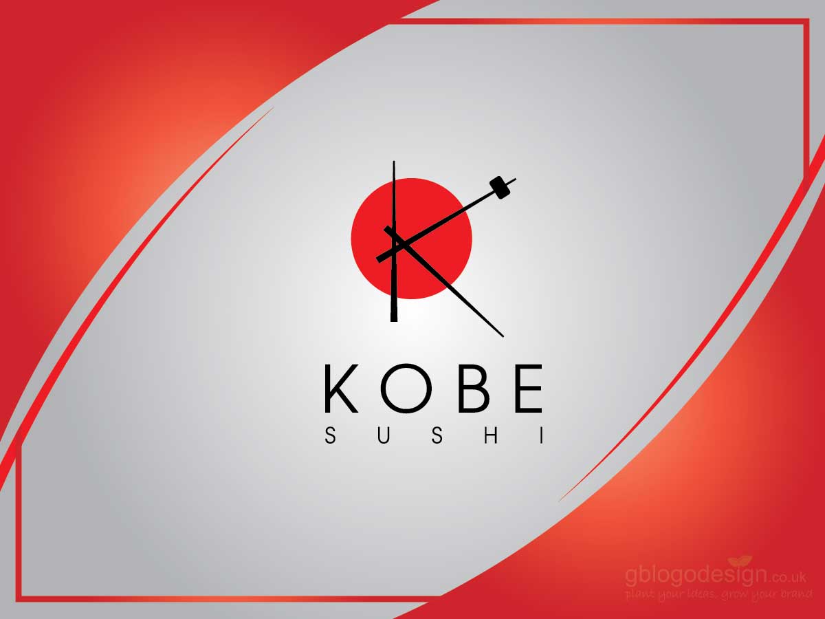
We prepared the logo for this sushi place, again in shades of red and black. The logo comprises of a red platter with 3 chopsticks arranged on it. The addition of a small sushi piece in one of the chopstick kind of completes the look.


3. Riccados


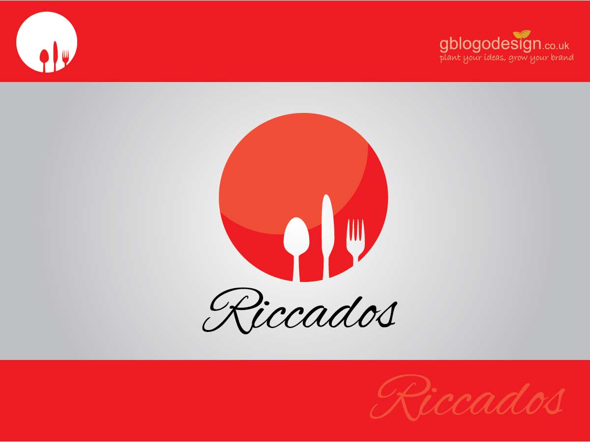
This is yet another, simple and subtle logo design for a restaurant. The silhouette of a fork, spoon, and knife is carved out in a red platter. A clever logo that calls out to its target audience in one go.


4. Fritz


This logo design compliments well with the hot dog business. The logo painted in red and white illustrates a fork piercing a hot dog. The steam coming out of the hot dog completes the entire essence of the logo.


5. My Breakfast


Omelette is the most staple breakfast that ties with bread and butter. The logo design in yellow and white is cleverly designed to resemble the initials M and B, as the yolk and albumin, respectively in the omelette.


6. Ron’s Curry house


This restaurant serves some of the finest Korean Breakfast for the folks around. The logo design uses the rich colors yellow along with white and brown. The logo consists of the icons of a typical Korean breakfast, rice bowl served with eggs on top, along with a pair of chopsticks. It literally calls out for you to have a bite.


7. Mmm Curry Curry


This was a logo design that was appreciated well, for being a rather unique that adds an element of fun in it. The logo uses yellow colors to draw a smiley with its tongue out to demonstrate that the restaurant serves only the lip-smacking food.


Feel free to let us know, which one made you drool over the thought of a yummy breakfast platter. In case, you too deal with serving the best in the neighborhood, order your logo design package with us, to trigger your business today.

Logo Design [blog]

Unlocking The Realm Of Google Logo Designs


When life strikes you with an unlikely question, who is the first resort we turn to, for help? It is Google silly. In fact, don’t we all just open it once in the office, every day, just to check out if there is any wonderful doodle, they showcase on a special occasion! The logo design of Google is one of the simplest, yet one of the most recognizable visual identity of a business, these days.


Google has a simple wordmark logotype that is painted in the colors, blue, red, yellow and green. The blue color represents trustworthiness, serenity. The color red represents, passion, and importance. Yellow color symbolizes happiness, warmth and color green symbolize, stability, nature, and prosperity.


Read more – Stella Artois Logo design


Google logo

Google is one of the most successful businesses that have a diversified product mix, more than 200. Most of them use their own, unique logo, but many drapes their logo designs in the same colors of Google logo. Let’s take a look at some such logo designs.


1. Google Chrome

The logo design for this internet server is a pictorial logo of 2 concentric circular disks. The small inner circle is painted in blue. The outer circle is subdivided into 3 overlapping sections, each painted in colors yellow, green and red.


2. Google Drive

The logo design of Google Drive is a triangular one, with a hollow inner cavity. The 3 patches of each arm are painted in blue, green and yellow. Wondering, what about the color red? Well, those who use it, clearly don’t need color red to emphasize its importance.


3. Google Mail

The Gmail logo uses the letter M in red to project the outline of an envelop, the very representation of the postal mail. It is a self-explanatory logo.


4. Google Play

The play store logo of Google is well-known among every android user. It is a triangular logo with overlapping sections, each with one particular google color.


5. Google Photo

The logo design resembles a paper windmill of 4 arms, with each one having one particular color of Google. It is a well-crafted logo, as pictures indeed evoke good memories.


6. Google Maps

The Google Map logo uses a square template that is subdivided diagonally, projecting a road in yellow, right in between the lush greenery and blue ocean. The red drop-like bubble pinpoints to the exact location on the map.


7. Google News


The logo represents a pile of paper bulletins stacked upon each other, only, obviously, in the Google logo colors.


8. Google Ads

The logo of google ads is a simple wordmark type, stating its business name with ‘A-like’ icon painted in blue and yellow, with a tip of green in it.


9. Google Docs


As it represents electronic documents, the logo projects 3 icons of paper in colors blue, green, yellow. It has a simplified icon as well, it uses the topmost blue paper only.


10. Bonus- Google Favicon


The favicon is a shortcut icon of google usually for the website. The Google Favicon is a G that is divided into 4 segments, each of the 4 colors of the Google.


Each of these logo designs has its own beauty, but Which one did you like the most, let us know!


Logo Design [blog]

Few More Animal Mascot Business Logo


Mascot logos are the type of logo designs that have their own lucky charm attached with their logo design. We, at GB Logo Design, keep designing these logos for our clients. Let’s have a look at some more amazing examples of animal mascot logo-


1. Koala Cosmetic


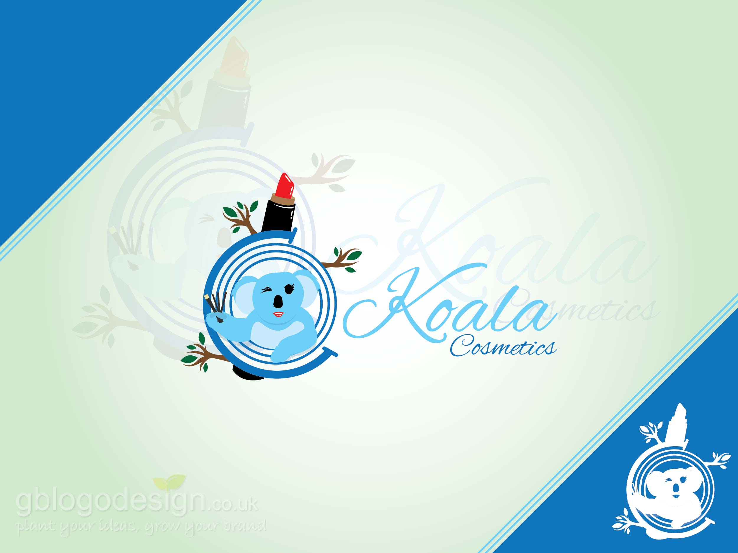
Not every day you find a cute koala putting mascara on its eyes, right! So when it does, you take a note of the business too. The logo for this cosmetic company has been designed with a mascot of its own, the koala. This is a very unique logo for a cosmetic company as most of them are generic types and this one has more potential to stick to people’s mind.


2. Spacedog Sweet


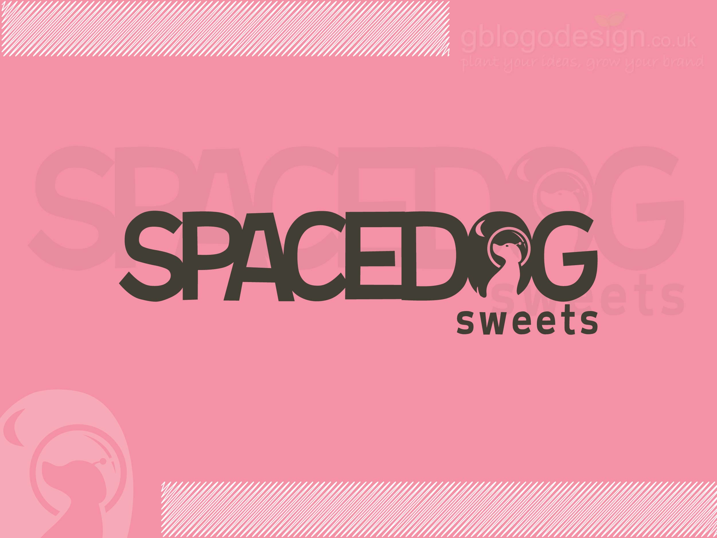
A dog is man’s best friend and thus it seems logical to take them along on the trip to space as well. The logo is a simple wordmark logo with a very customized O. It resembles the ambiance of the space with the dog sitting and enjoying a view of the moon. The addition of the tail was thoroughly praised by our client.


3. Sprightly Pets


Love comes in every size and skin, especially when they are pets. The logo for this business was crafted with love. The logo comprises a heart painted in pink. This heart has 3 animals carved in it- cat, bunny, and pigeon. The pink color evokes the emotion of love, affection, and care.


4. Pet A Doodle Doo


The logo of this pet care and pet grooming business is a special one. In fact, our client agreed with the first option itself. The logo is a simple wordmark type, with 2 icons of a cute dog in it. It is placed in a way that its eyes in place on the O’s. This logo is hard to miss to spot and stays in mind for a long time.


5. Twisty Tails


This is a very cute logo design for this business dealing with children stories. The logo comprises of a cat peeking from a hilltop with the business name written on the blue sky. The cat is sitting with a cutey expression and wagging its twisted tail, thereby justifying the business name as well.


Are you too having a business or organization that involves the animals or have their name on it? Then get a customized logo from the house of Gb logo design and uplift your brand name.


Logo Design [blog]

5 More Eye-Catching Photography Based Logo Designs


We all at least have that one friend owning a DSLR and taking snapshots of everything around them. Indeed, photography is becoming a very shared passion among the youths these days. However, the most amazing shots are captured by professional photographers itself, who tirelessly wait for the right moment to take that shot that stand alone from the rest. Needless to say, it is only fair to have a professional logo design for these professional photographers.


Let’s have a stroll through 6 more photography logo made by the house of GB logo Design.


1. D Avino Photography


Unlike several photography logos, this one does not have a camera blended in its logo. Why? Cause this business is not a new name to its clients. Its quality of shots speaks for itself. The letermark logo was created using the initials D, A and P stacked in a rather creative way. Clearly a logo worth remembering.


2. Ed The Frog Photography


This free-spirited photography business is all set to capture the beautiful moments and inspire people to live it. The logo is designed to keep this spirit up. The enthusiast frog photographer is peaking through the O of the wordmark logo of the business. The addition of the camera hanging by a thread to the frog completes the picture.


3. Mini Memoirs Photography


The logo for this photography business is a simple wordmark tye. But the stacking of words makes it special. Th word ‘MINI’ has been pilled lengthwise in a much smaller font and the O has been designed to resemble it like the shutter of the camera lens. Overall a logo wisely created.


4. Mugshot Photography


Now, we all have seen mugshot photography in movies and series, but don’t let it refrain you from availing this excellent photography service. The logo of this photography business was designed by keeping its name in mind. The pink silhouette of the camera is carved to accommodate a human figure in its center. I justified logo for a classy brand.


5. Neil Nevil Photography


We created some of our best-delivered logo design options for this wildlife photographer. We created these using beautiful majestic wild animals. Our client liked them all, but the one that finally made it to the brand recognition is the one with the mighty owl flying through the night sky.


On this world photography day, we inspire every aspiring photographer to get a professional logo to enhance their enthusiasm and boost their career.


Logo Design [blog]

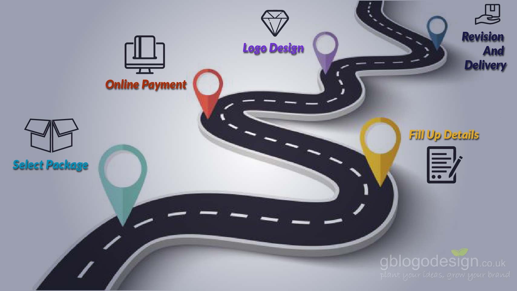
Step By Step Procedure Of Getting A Logo Design From GB Logo Design


The realm of the internet is making things easier and more convenient. Let’s say that you are in need of a product or service that is being provided in a geographic location miles away from you.


Even if you are a newbie in the realms of logo designs, not a problem, as the house of GB logo design is all set to help you get an original, authentic and customized logo design.
The world never sleep these days, it stays online 24/7


Here, we present the procedure we follow to deliver logo design to our clients


1. Visit Our Order Online Page And Explore Packages

We believe every business has its own set of needs. To match everyone’s tailored needs, we offer logo design packages with logo options of 2, 4 and 6. Now we understand that you might need minor revisions, so we offer unlimited edits with every package of ours as a complementary.


2. Fill Up Other Details

Upon selecting the package you will be redirected to a form with several fields associated with your business name and type. This form will collect details that will help designers to assess what logo will suit your business the best.

If you find any difficulty, you can get in touch with us right away. We have facilitated an option of chat inquiry as well to help you through it.


3. Payment Portal

After you are all set, you will be redirected to the payment gateway and upon its approval, your order is officially placed, our designers get started with your logo requirement. We will also notify you back with a confirmation mail of the same. It takes in between 1-2 business days.


4. Logo Design And Unlimited Edits

Our designs create the logo options for your business after a thorough research and edits. We send them over to you for approval. Most of our logo designs get the green signal in the first go itself. But we also welcome the clients who want few improvised details. As a matter of fact, we make edits until the point they are satisfied with their logo design.


5. Final Files

When the final files are ready, we send you a final file of the logo option in every file format. These include both raster and vector file formats. Each of this format has its own uniqueness and will help you use it in both online and offline use.


So, you see how easy it is to get your professional logo with us! Place your order for a customized logo with us now!


Logo Design [blog]

Why Startups Need A Logo To Ensure A Steady Growth


‘Journey of a thousand miles starts with a single step’


This inspiring line aspires many young entrepreneurs to establish a business on their own. There indeed is a thrill to make something from the scratch, isn’t it? But having a unique identity and approach is what will make your business stand out from the swamp of other startups. A customized logo design is what can help you make it happen. Why having a unique identification is crucial? The number of startups booming these days is at least 5 times more than it used to be even before 5- 6 years ago.


The government financial support is certainly helpful, but your startup’s lifeline entirely depends upon your business idea, implementation, and strategy, which all starts with an impressionist logo design. As per statistics, only 3 out of 10 startups make it to its 2nd successful term. But thankfully, once you make through its third term, chances are sky high that you will make it through thick and thin in the upcoming years as well.


The startups that crack a unique idea have the chance to create a monopoly for the time being. But not everyone can do it. Thus, there are many startups that are offering same or similar products and services in the similar price range. Thereby, the business that will get more customers will outrun the others. Needless to say, a customized logo is most crucial for the startups that are yet to make any other impression in the minds of the target audience yet.


Even though paying for a customized logo even before making any profit might seem and is a little expensive, it is for the best benefit of your business. Many startups with good potential fail to make an impression as they often go for generic, free logos from any underrated site to save their money. But in reality, it’s not actually free, their business is eventually the one that pays the actual cost of the same.


Read more: Why you should stay away from cheap logo designs.


If you are a young entrepreneur too, you need to make your logo design speak for itself. Take a look at our portfolio, we have made numerous customized logo design for startups. So, invest in the right place will make sure of the maximum return on investment. After all, remember what every economist agrees, ‘no one makes millions by saving, but by investing right’


Logo Design [blog]

Power Of Logo Design In Business Diversification – Walt Disney Case Study

Diversification is one of the best strategies to expand the horizon of any business. The chain of restaurants and MNC achieve this by expanding their location. While several food and beverage industries often implement product and service diversification, to attain the same. Either way, their original logo design has significant contributions towards the same. Today, we will study the logo design adaptation of one such brand that adapted both these techniques.


The Walt Disney is a leading brand in the realm of mass media and entertainment but also owns the franchise of several characters and theme parks. Let’s take a look at the logo designs it uses for every domain.


Walt Disney decided to go with a simple wordmark type logo for its pioneer business the ‘Walt Disney Company’.


Walt Disney Animation Studio did the same. However, it also added the Mickey Mouse on top of it. Due to its trademark license, the Mickey Mouse is an intellectual property of the brand too. Eventually, all the other Walt Disney characters were registered as well.


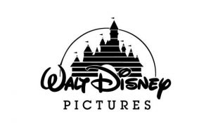
Walt Disney Pictures is one of the most renowned logo design. The addition of the Disney castle makes it the perfect logo for a magical world. Later on, it was modified into an animated logo with a lot of fireworks.


Each of the Disneyland theme parks has a similar logo, with its name inserted along with the original ‘Disneyland’ logo. All of the theme parks, being the franchise of Walt Disney World, enjoy the perks of portraying the Walt Disney characters.


Disney Channel used the original Disney wordmark logo design along with the addition of the outline of Mickey Mouse Ears. It was mostly inspired by the pioneer of animated shows featured by the Disney Company, such as Mickey mouse clubhouse.


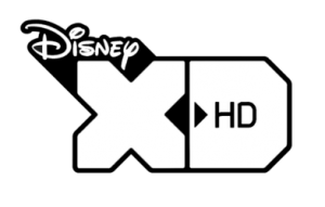
Disney XD, an upgraded Tv channel too used the original Disney with large icons of XD. This HD channel adapted the new trend, but kept the essence intact.


As it can be seen perfectly, the This original font of Disney has been used again and again in several other Disney segment brands. Needless to say, it is yet another perfect example of an ageless logo that shines throughout the time. You too can get a customized logo design that will carry your brand name. After all, the empire of Walt Disney started with a small studio too.

Logo Design [blog]

Stella Artois- A Classic Example Of An Ageless Logo


Whether it is small, medium or large, every organization has a logo design these days. Several aspects of successful business such as digital marketing are in trend only for a previous couple of decades. This often gives rise to a misconception that even logo design is a new thing. However, it is far from the truth.


Even though, statistically, the number of logo designs in the present time period is significant as compared to previous years in history. This is true only because, nowadays every organization is realizing its importance and adapting them. The history of logo design is age-old. Today, we will discuss a rather special logo of Stella Artois, a beverage company founded in Belgium.


The exact date of its corporate origin of this beer company is still a matter of argument, but the tax records indicate it to date back to the year 1366. the business name Stella Artois is named after the Christmas star and as it clearly indicates, it was first launched as a seasonal beverage, available only during winters. By the time of post World War 2, the popularity of the brand was so hyped that it became a year-round beverage. Moreover, it was exported to European markets as well due to its significant commercial success.


The logo of the brand is a wordmark type logo. The color red is most prominent in the logo, evoking the sense of urgency. The color golden yellows add a hint of sophistication to the logo. The logo also comprises of an icon of the horn, geometrically mirrored floral design and the date of the year of its foundation.


Several managerial transfers have been observed within the organizational structure of Stella Artois, but the essence of the original logo has been kept intact, along with the packaging. This clearly shows the powerful impact the original logo has. This is clearly a classic example of an ageless logo.


Nowadays, several famous beer brands established a decent presence globally. However, the market position of Stella Artois is still going strong. The logo design instantly evokes the sense of familiarity and trust among the consumers, even though they are a little tipsy, or a lot.


You want an ageless logo for your business as well? Order your custom logo design online with us and make it happen.