Tag: Customized Logo Design

Logo Design [blog]

5 Things Your Business Logo Design Should Be Able To Do

5 Things Your Business Logo Design Should Be Able To Do - Gb Logo Design

The importance of having a customized logo design is unparallel. Thus almost all successful business have their very own, customized logo design. However, there are many such forms offering similar services, and it is crucial to check a few things.

Today, we offer a few tips as to what your professional logo design should be able to do.

1. It Should Be Scalable

Scalability is the property of a digital entity like a logo design that can be adjusted to practically any size, without suffering any deviation of the original version. Failing to do so will lead to several complications such as pixalation upon stretching and data loss while compression.

2. It Should Be Transparent

Transparency is the property of a logo design that enables it to have a transparent background. It helps you to past it upon any background of your choice, without compromising its looks. It enhances the logo design’s aesthetics significantly in other stationeries and background.

3. It Should Have A Proper Color Palate

There are basically 2 color palates- CMYK (cyan, magenta, yellow, black) and RGB (red, green, blue). It is crucial that your logo design is either of them and you know which palate exactly. It will come handy to make changes if needed.

4. You Should Have An Editable Raw File

The editable file is an image file format in which the designing firm provides the final logo design that enables you to make minor edits easily (or totally revamp as well, if it’s needed). Make sure your logo must have an editable raw file format, so you don’t need to pay extra later, unnecessarily.

5. It Should Be Suitable For Adaption

The logo design is your sole visual identity, thus you will need to use it all your business profile. Let it be a website button or online transaction bills, or printed on paper brochure., your logo design should be used in all. So, it’s crucial to make sure its file format allows the same.

How many of the above-mentioned aspects holds true for your brand logo! From the house of GB Logo Design, we offer all these features, inclusive as our package. For more information, get in touch with us.

Logo Design [blog]

Amazing Lettermark Logos That Instantly Speaks For Itself


There are a variety of customized logo designs that are ruling the realm of logo designing these days. However, there are 4 main types of the logo design. Each has its own set of advantages and scope. Today, we are going to elaborate one specific type of logo, namely the lettermark logo.


The lettermark logo uses the initial acronym of the business, instead of the entire name. It is particularly helpful for businesses with lengthy or complicated names. Here we present a few examples of customized lettermark logo designs that have been designed and delivered by GB Logo Designs.


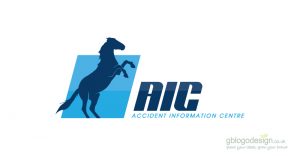
1. Accident Information Center

The logo for AIC (Accident Information Center) is a simple and appropriate one as it represents the business that offers help and support during the hours of duress. The logo has been designed by using a silhouette of a horse that represents promptness and alertness that the business ideally commits. The color blue furthermore represents faith, dedication, trust, and wisdom.


2. Daniel Jones Personal Trainer

The logo for this particular client was designed to match his needs. The initials of the Daniel Jones have been highlighted in the logo along with icons of two dumbbells and weight-lifting equipment. The logo is painted in ombre colors of orange, which represents emotions like determination, enthusiasm, encouragement etc, which closely relates to bodybuilding.


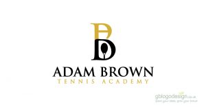
3. Adam Brown Tennis Academy

The logo of this academic organization has been designed very cleverly with the initials A and B are overlapped, one top of the other. The letter A also mimics the net and the letter B encapsulates a small icon of tennis bat. Overall, it is a logo that speaks of its business in minute details.


4. Earth, Wind and Fire Consulting

There is no such thing as ‘one solution fits it all’ and the Earth, Wind, and Fire consulting agency know it all. Thereby, it promises to go any length in every domain to deliver the best solution. The logo of this business bears the initial of all its three elements ‘e, w and f’ in broken letters. A perfect logo for a perfect business.


5. Eighteen Sixty

Who says the initial can only work for words and letters? It comes handy for large numbers as well. The logo for this particular business is quite simple and yet effective as it uses the numerical numbers 1860 in broken letters. It saves a lot of space and makes sit easy to bear in mind.


Does your business name also sound like a long monarch family name? Get it trimmed and groomed into a customized lettermark logo design by taking a step towards GB logo design.