Should You Consider Lettermark Logo For Your Business?
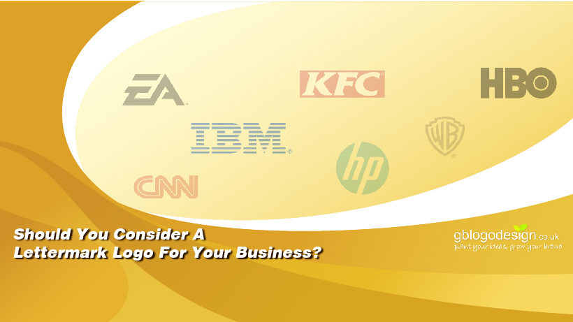
Having an impactful logo design plays an important role in the overall marketing strategies. Thus, it is needless to say, it has to be suitable for your business. Most businesses, commonly showcase the entire business name as the logo design. However, there is a trend of a particular type of logo that uses only the initial typography, instead of the entire business name. These are called the lettermark logo design and some of the famous examples of the same are IBM, NASA, CNN, HP, WB, etc.
Lettermark logos are a suitable choice for many business types, but, it is particularly helpful for certain kinds of businesses.
Let’s understand them one by one-
1. Your Business Has A Rather Lengthy Name
If your business has a lengthy name and sounds like the official title of some Monarch, your consumers will have much difficulty recalling it. Using the initials is a more convenient choice in such cases. One such Notable example is Price Waterhouse Coopers, the initial PWC is a well-known business all over the world, and it is not a surprise to find that not many people know its full form.
2. The Abbreviation Is Easier To Speak
Even if your business name is quite simple to speak and literally stands for your business, its abbreviation is often more easy to speak. A notable example is HBO. Ask yourself, which one is more convenient to speak, Home Box Office or HBO!
3. Your Business Name Is From A Foreign Origin
Globalization has made spreading business over the entire globe quite convenient. However, if you are having a business name with the origin of a foreign language, it might be hard to pronounce by non-residents. This logo type is particularly helpful for the MNCs.
BMW is a noteworthy example. Its full name is Bayerische Motoren Werke, from the German origin, it translates to Bavarian Motor Works, in English. This well-known automobile company’s full name is difficult to pronounce by people in many parts of the world, while the acronym does a pretty good job.
4. Your Business Name Is Not Very Relevant To Your Overall Business
Did you finalize your business name exactly relevant with your product/service range during its pioneer time, but then spread with others as well? In such cases, using the entire business name is irrelevant and thus, the lettermark type logo works much better.
ITC, a well know Conglomerate industry established in the Indian subcontinent is the perfect example of such a case. Earlier it predominantly dealt with Cigar and it’s business name was rightly set as Indian Tobacco Company. However, currently, it deals with FMCG, hotels, and many other industries. Thankfully, they went for the lettermark logo and thus, it still enjoys the perks of using its original business name and logo.
Do you think, your business will drape the lettermark logo well too? Hire the professional designers of GB Logo Designs and uplift your business like never before.

