Importance Of Having A Good Logo In Restaurant Businesses
The logo is a representation of a brand. It conveys the brand message and acts as a symbol of a particular brand in order to introduce it in the marketplace. Therefore, if you have an appropriate logo design for your restaurant, it can play the most vital role in the branding and marketing of your restaurant. Thus, in turn, a good logo design helps to create a band of loyal customers for a restaurant business. However, this blog penned by the professionals of GB Logo Design which makes professional logo designs in the UK will discuss the importance of a good logo design, especially in restaurant businesses.
Creates a brand identity for the restaurant

Remember, a logo design is the best way to reinforce the brand identity. And, when it comes to brand visibility, a logo design helps you to connect with all your potential customers out there. Logos play a critical role in impacting customers’ choices while ordering food.
It can sum up the motto of your restaurant

When you think of a name for your restaurant, it will be something that is suitable for your business. Likewise, when it comes to a logo for your restaurant, it must match the motto of your restaurant so that it can sum up your restaurant via its visual representation. Once customers get to know the story about your restaurant, they will be able to relate to it more, and it will bring them much closer to your restaurant.
Grabs the attention of the potential customers

One of the most vital tasks a restaurant logo design does is that it attracts the attention of the customers. Since human beings are highly visual, an interesting restaurant logo design somehow manages to seize the observation. For that, a logo design has to be impressive and it must convey the concept and service of a restaurant.
Makes a restaurant memorable among the folks

People are seen to familiarize a restaurant with the help of its logo. This is because it is a basic human tendency that people easily remember what they see instead of what they read. A logo gives the customers a helpful piece of information to recall the restaurant in the future.
However, these are some primary reasons why a restaurant logo is so important. Therefore, consider getting your restaurant logo professionally designed by a highly skilled logo maker. Check out the best Logo Design Packages in the UK.


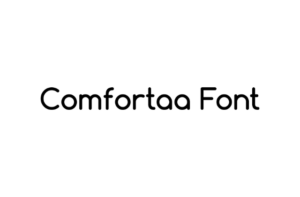
 Just like its name, the entire look of this font is sweet, feminine, and childish. It is a must-try for the businesses that fundamentally sell snacks, women’s and children’s products, such as ice cream, chocolates, cakes, toys, or spa and salon services.


